Sharon Reich. Personal logo, tagline and graphic language
Sharon and I have known each other for many years. We worked together on some branding and advertising projects. Me, the designer and she, the project manager.
Since then she made a professional conversion to real estate marketing and brought there her advertising experience, understanding of branding and marketing.
She opened a company for marketing real estate projects. The company is an external arm that provides everything needed, 360 degrees branding, marketing and sales of real estates properties.
The service as well as the branding are bold, high-ended, professional, presence, with a lot of chic and style.
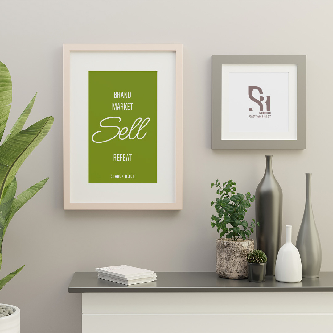
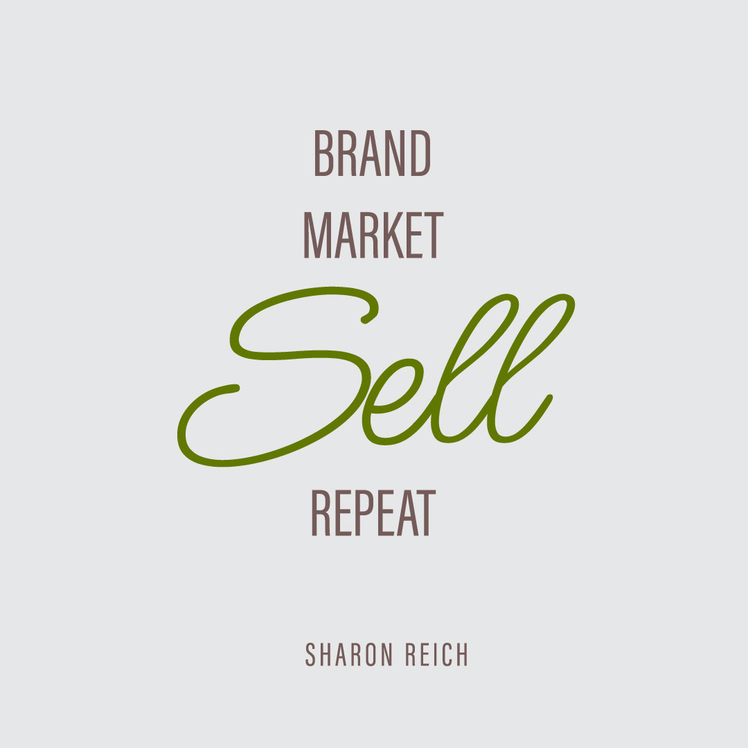
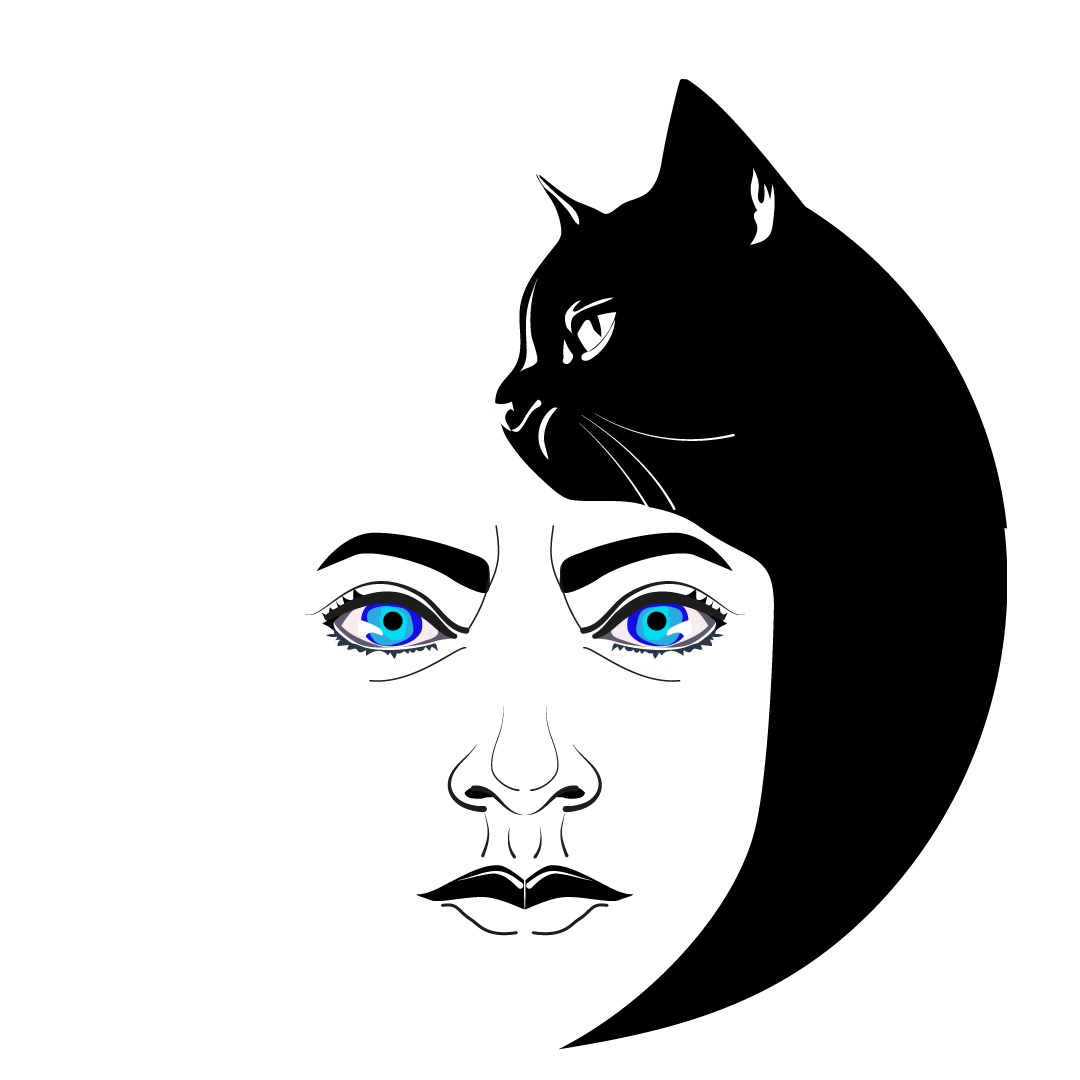
The inspiration came from the worlds of interior design and lifestyle, magazines and empowerment quotes.
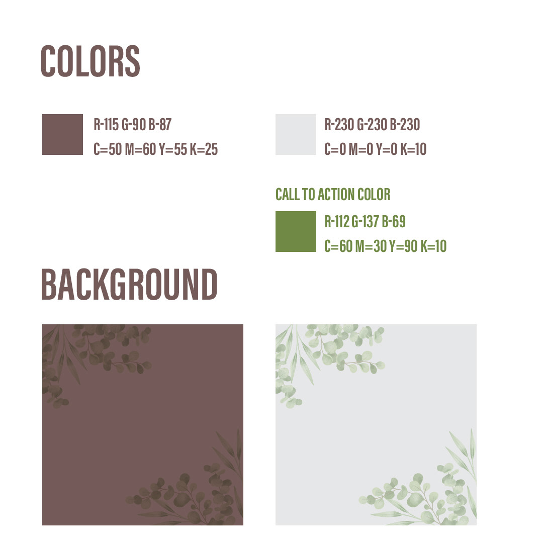
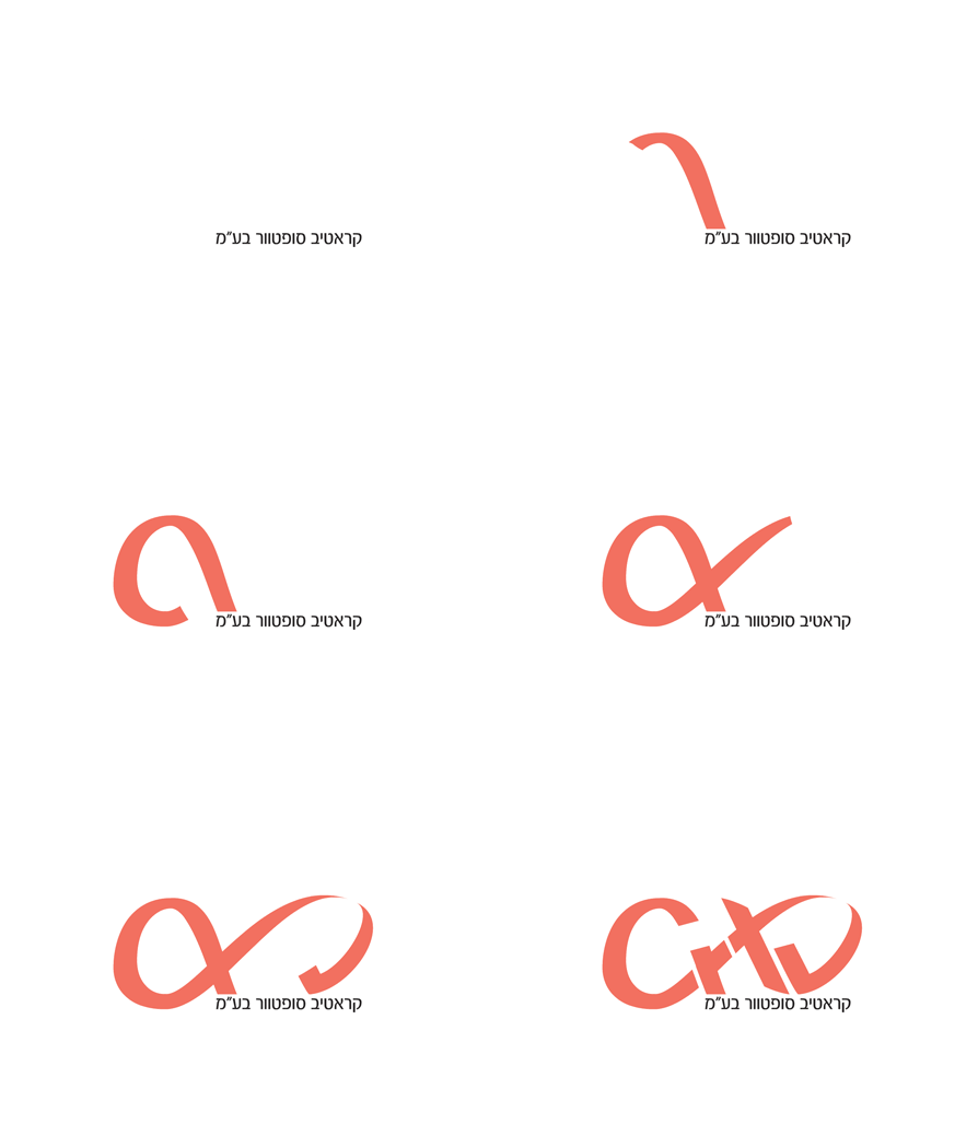
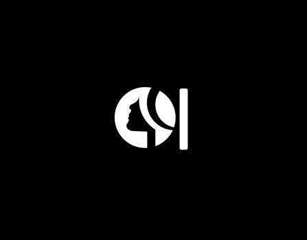
Soft and pleasant shades alongside strong, clear and thick lines. The relationships between the spaces created within the logo correspond with the world of real estate.
The look and Feel is very clear, polished and professional, fashionable and strong as the nature of the service.
The tag line: “𝙈𝙖𝙧𝙠𝙚𝙩𝙞𝙣𝙜 𝙥𝙤𝙬𝙚𝙧 𝙩𝙤 𝙮𝙤𝙪𝙧 𝙥𝙧𝙤𝙟𝙚𝙘𝙩” comes to support and strengthen the message and also to tell the exact story of the company and its added value:
The Marketing power, because you get the marketing and sales services in one place.
There are not many companies that specialise in both marketing and sales. This is what gives the power to push your project marketing forward.
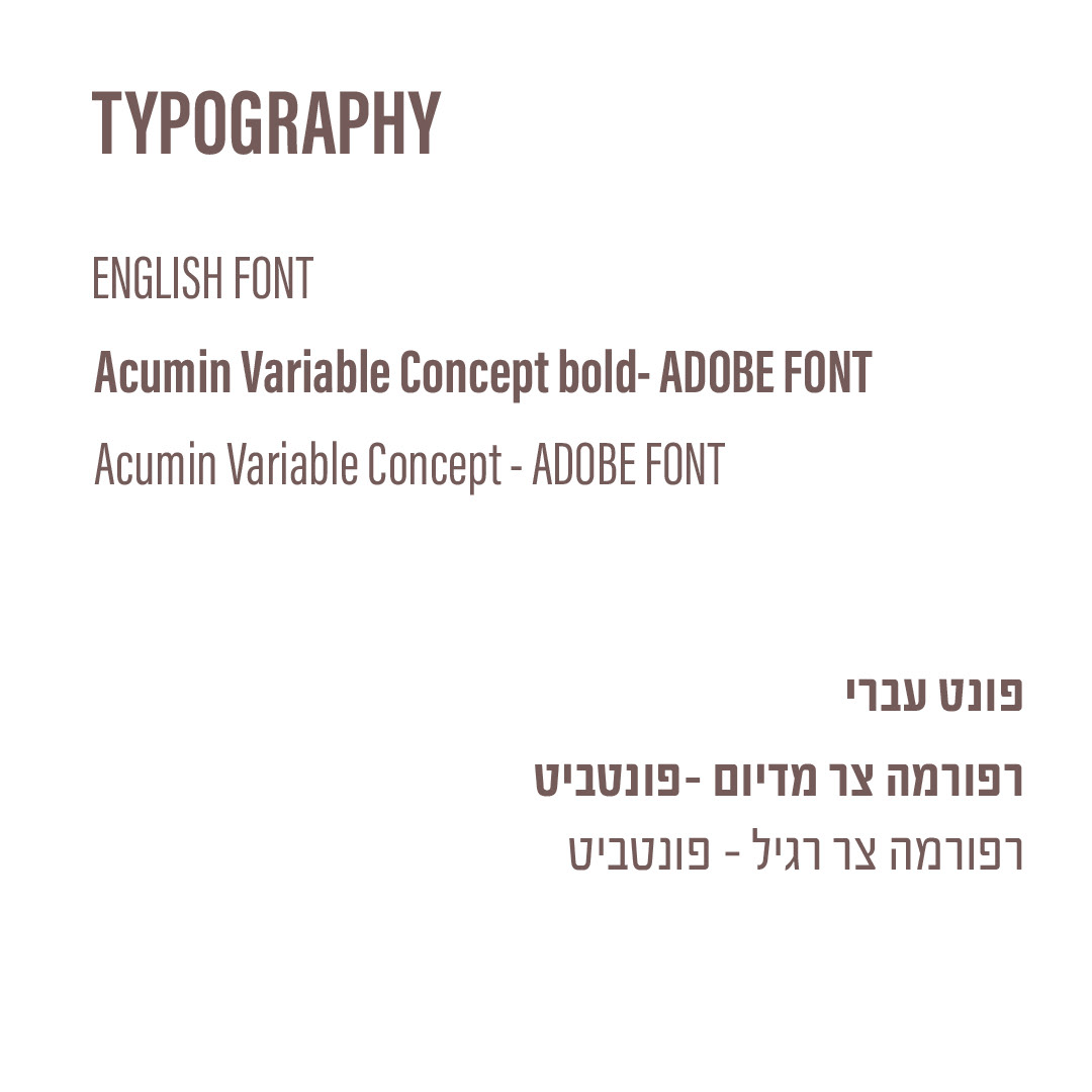
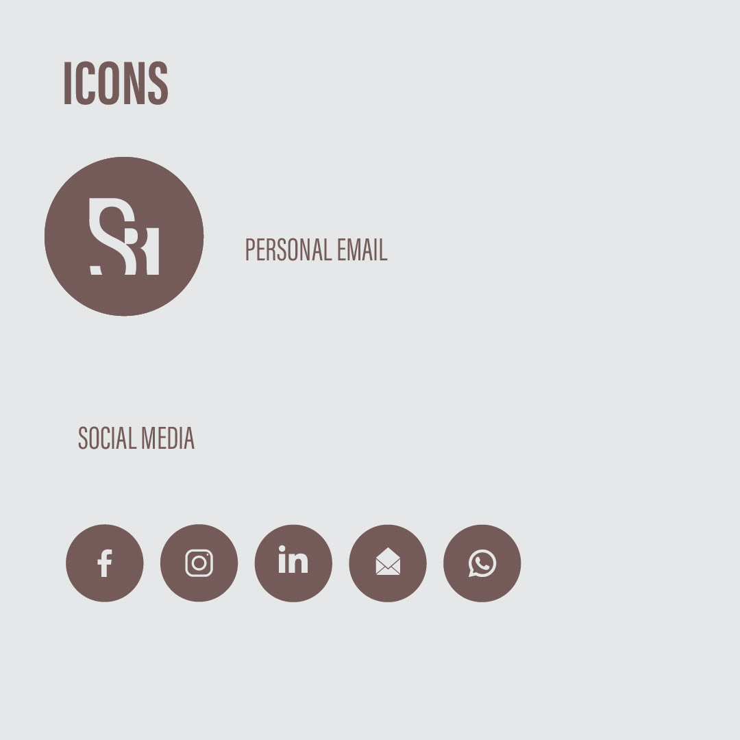
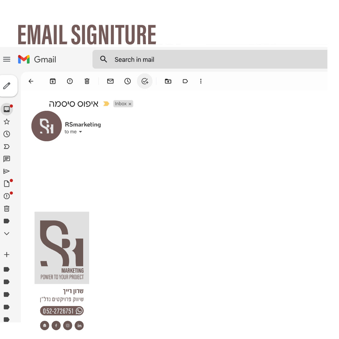
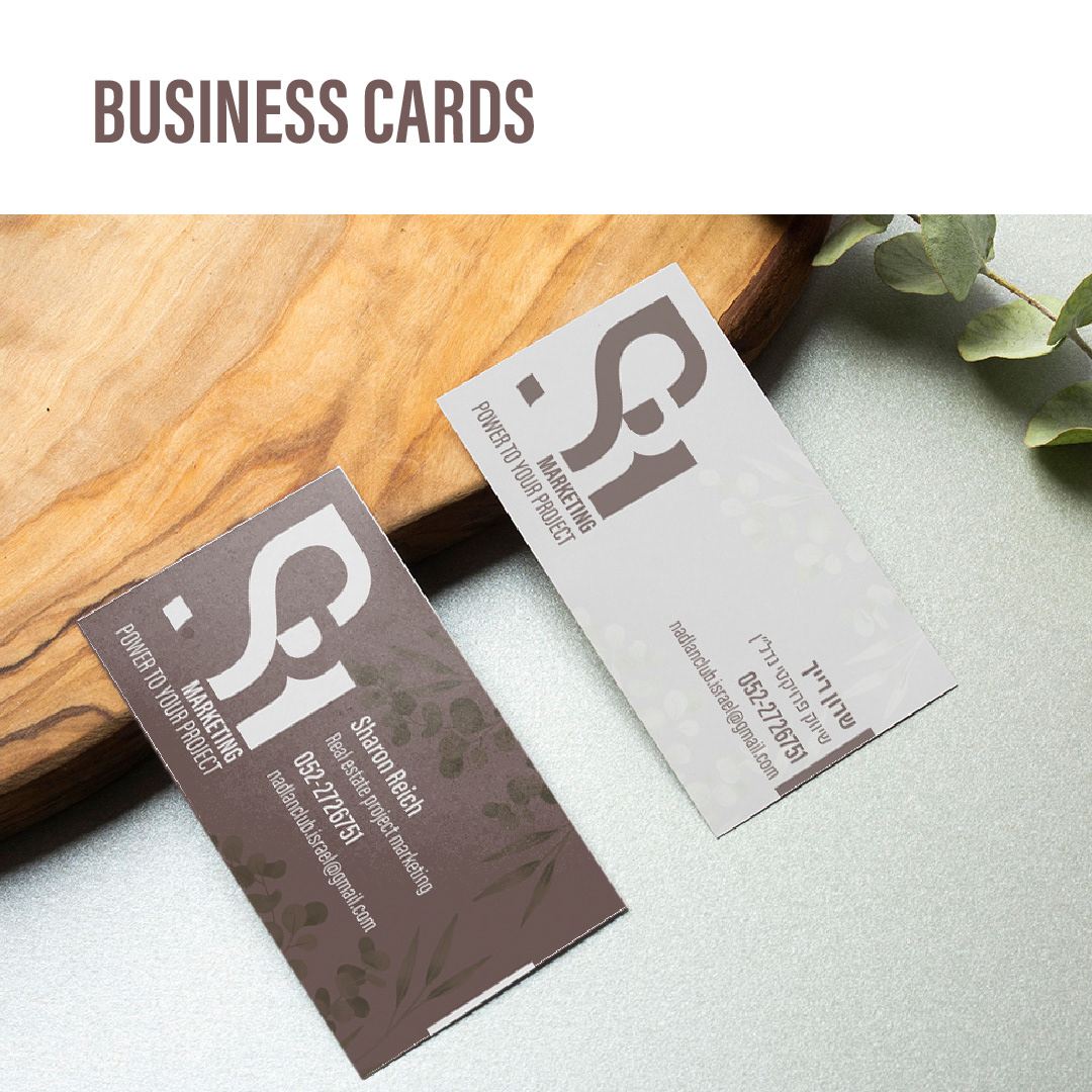
The package included a logo guideline document - containing the logo and all information related to branding. The colours and the fonts, and how to use them. It includes all the necessary versions for use on the Internet or for printing. Dark, light, vertical or landscape format. Business card design, e-mail signature, profile picture, icons and mood pictures to posts on social networks.
Logo Guidline
